This post contains notes and screenshots from WWDC accessibility videos.
Accessibility in SwiftUI (WWDC 2019)
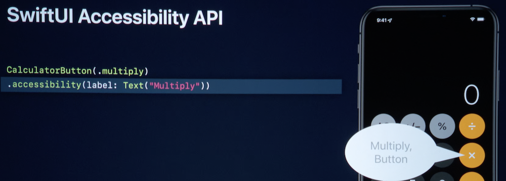
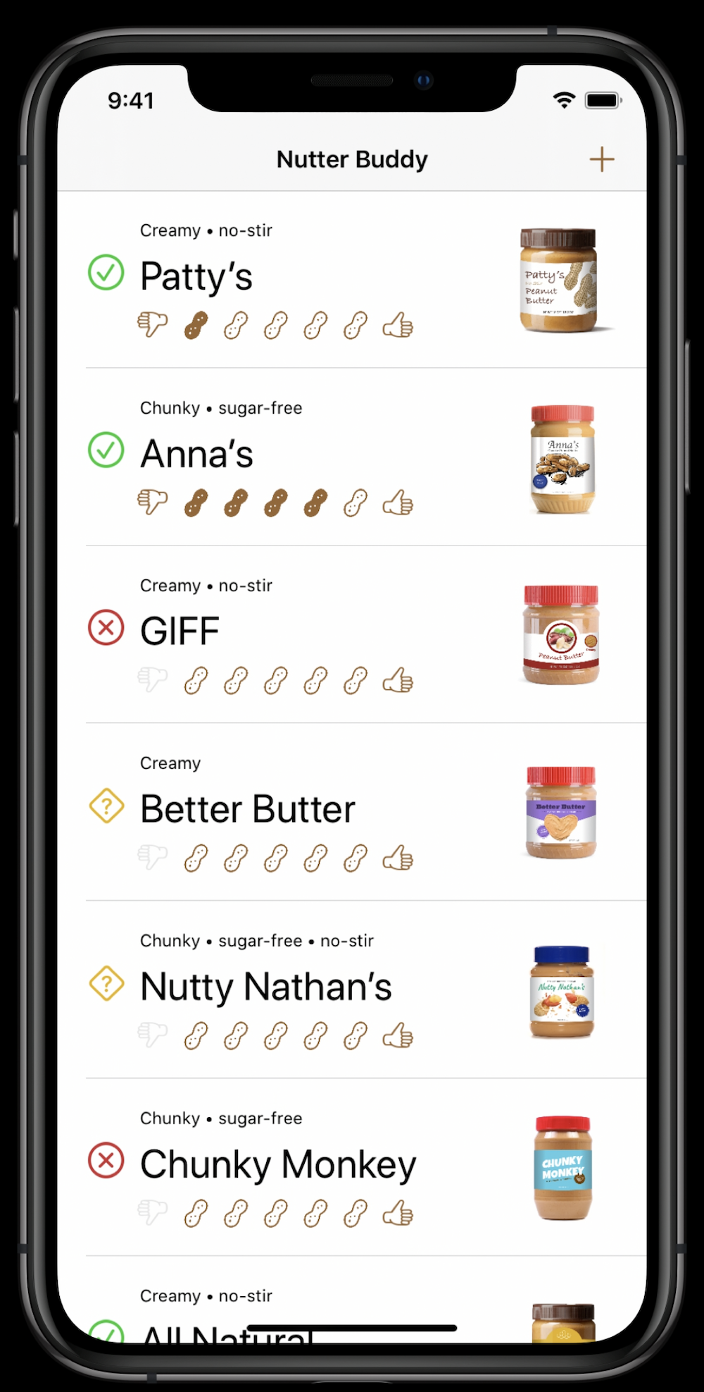
– Add label to describe Images:
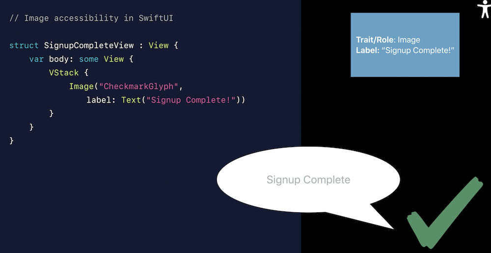
– Or make Image decorative when the rest of the text describes well the situation.

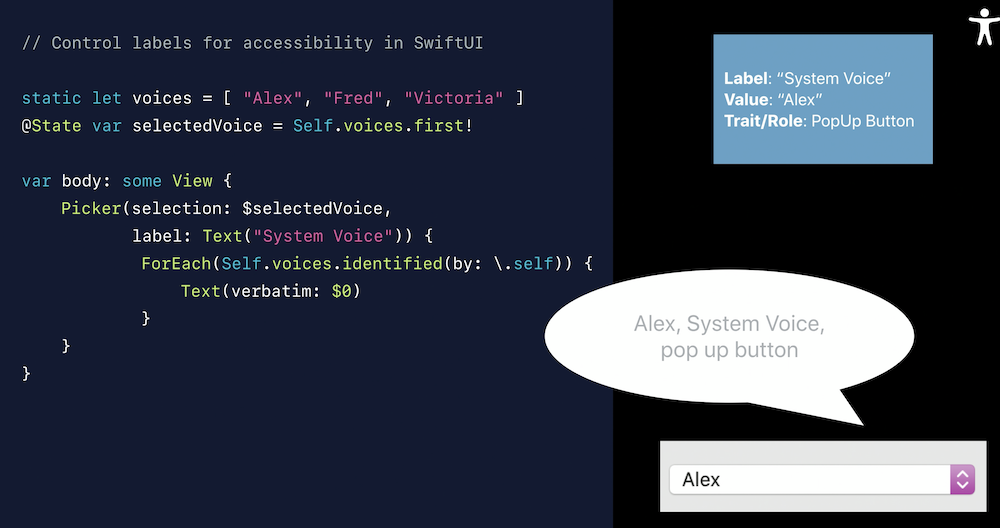
– For Picker or other native elements with labels, use the labels to make text more informative
– Make text more clear
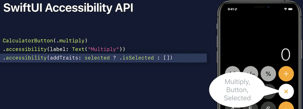
– Add Selected trait where necessary
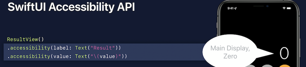
– Use accessibility value where necessary for better description
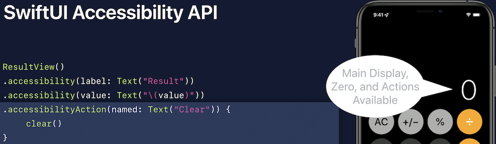
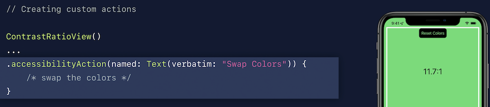
– Add accessibility action
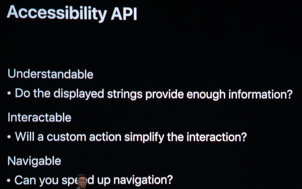
* Traits of good accessibility design:


– Group / Semantic View
– Set order priority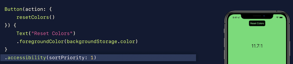
Making Apps more Accessible with Custom Actions (2019)
- Reducing Clutter
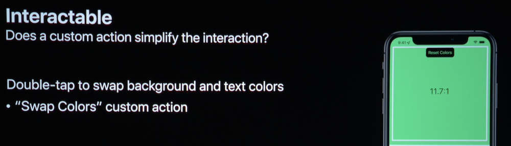
- Convenience and Speed

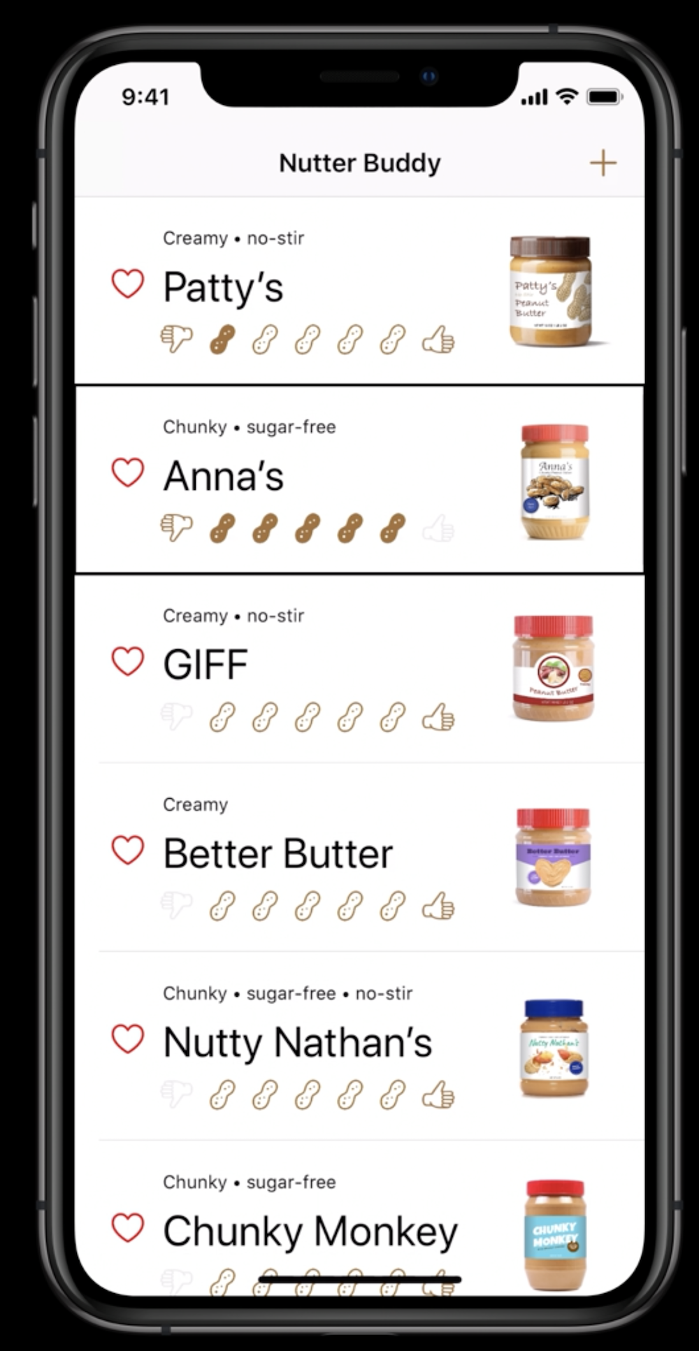
Writing great accessibility labels (2019)
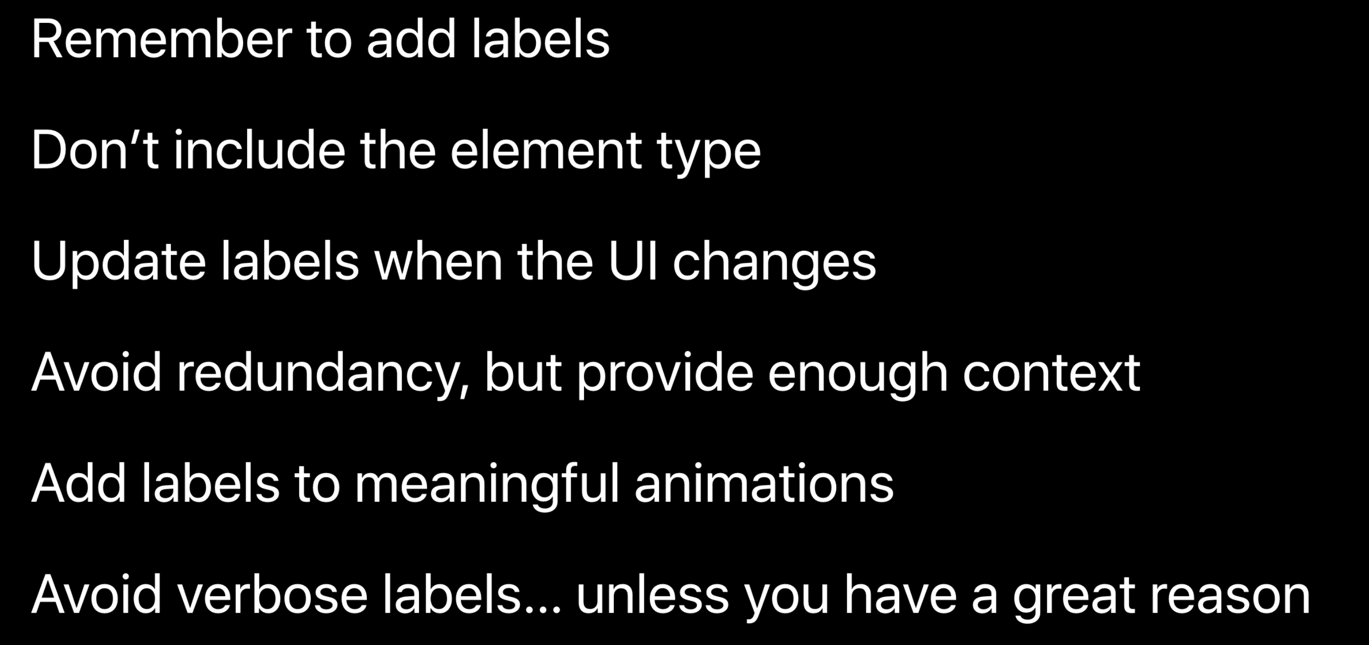
Provide sufficient content

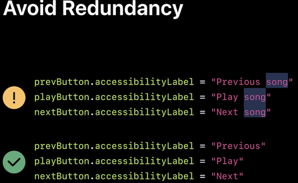
Avoid redundancy
Add labels to meaningful animations

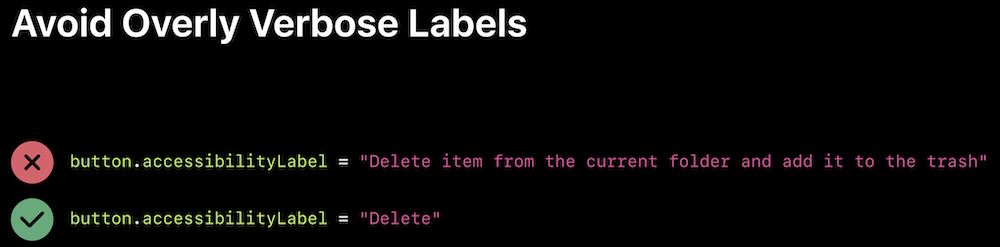
Avoid overlay verbose labels
Visual design accessibility (2019)
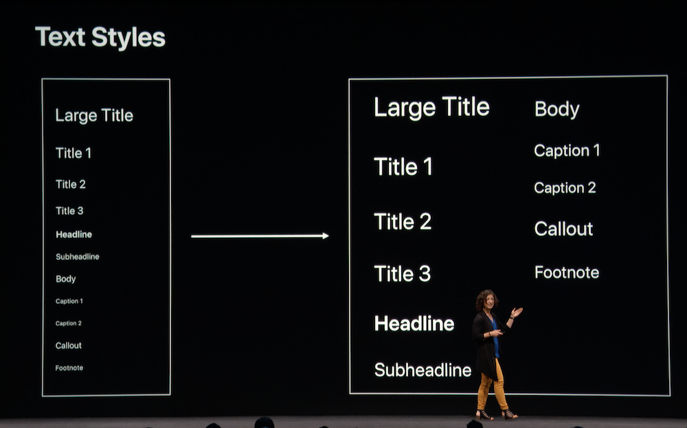
If text can be dynamic, it should be dynamic

Don’t truncate text
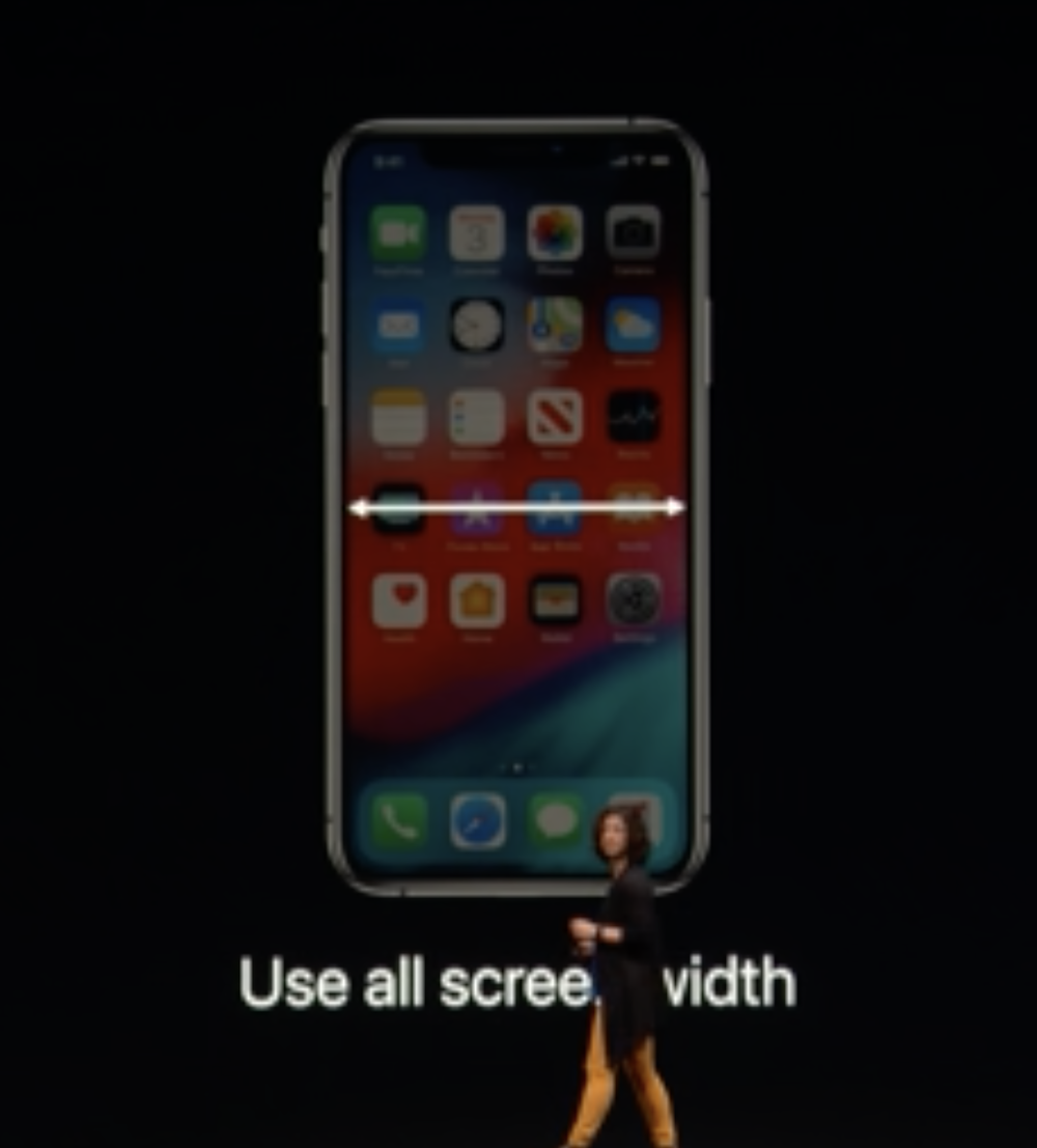
Use all screen width
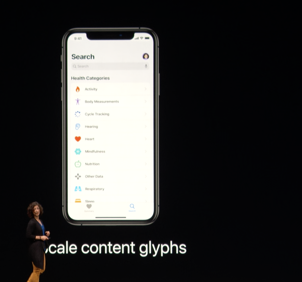
Scale content glyphs
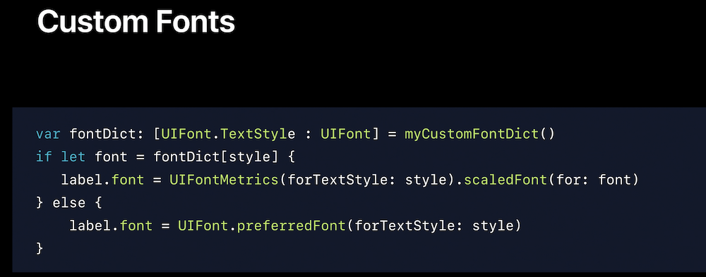
automatic dynamic size support with text styles:

and with custom font
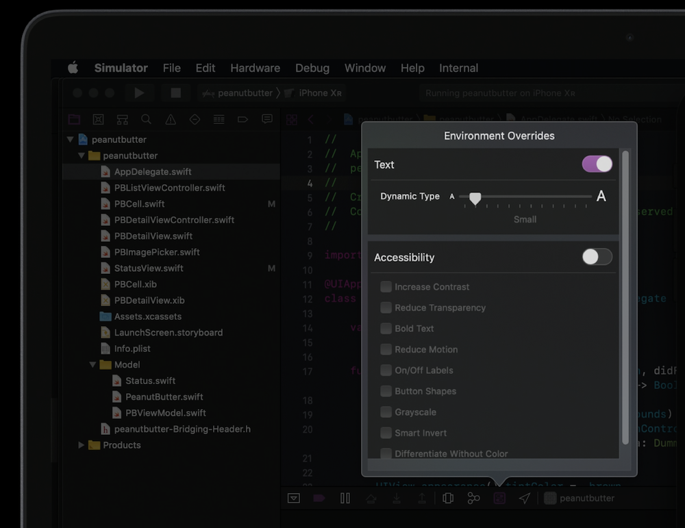
can easily be tested on Xcode:
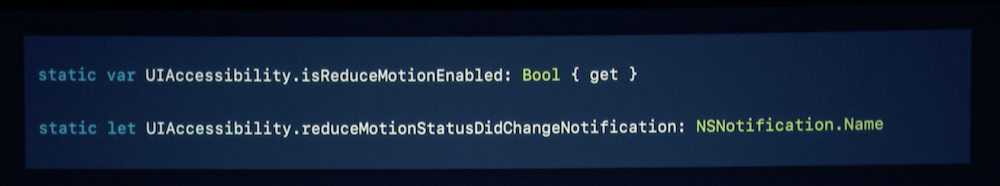
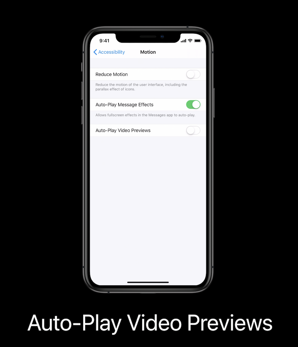
Detect reduced motion
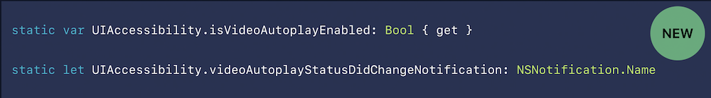
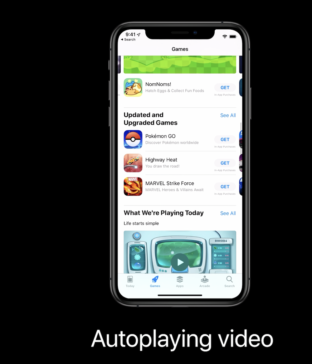
Autoplay video
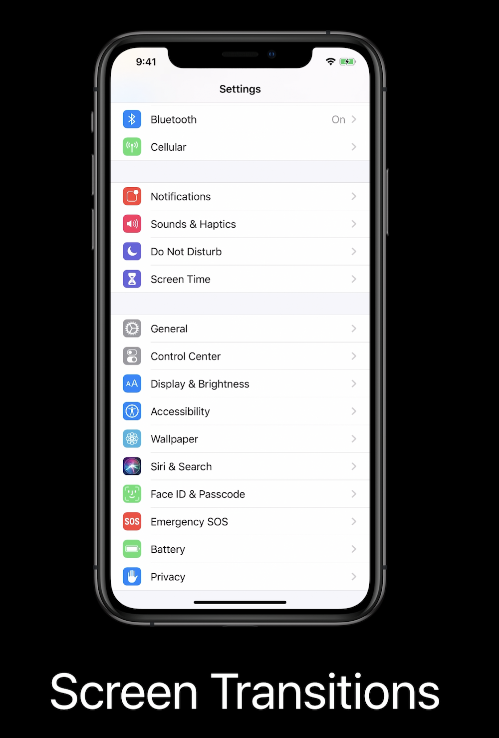
Screen transitions

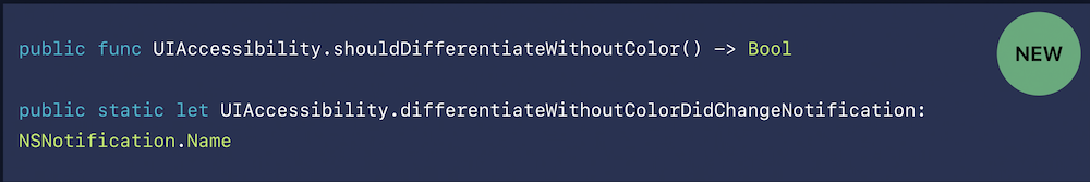
Differentiate with colour


Accessibility inspector (2019)
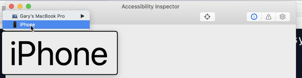
Open Accessibility inspector:

Chose device:
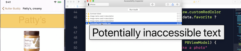
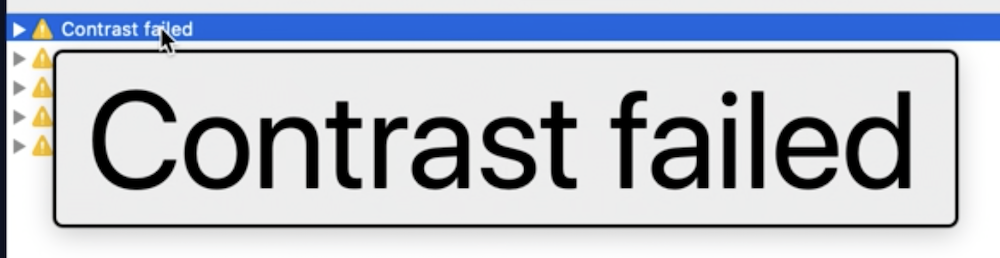
Run audit
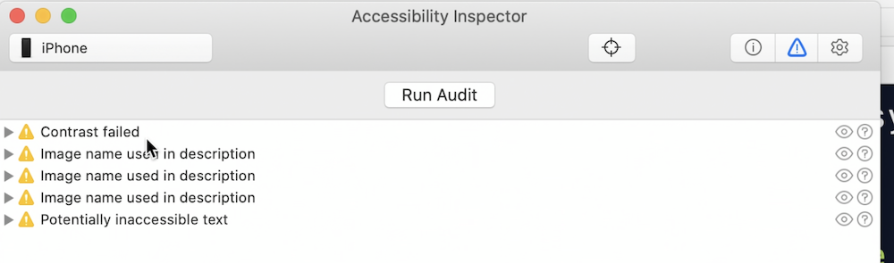
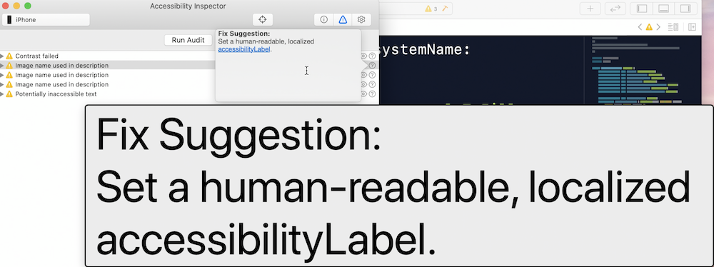
Image name missing

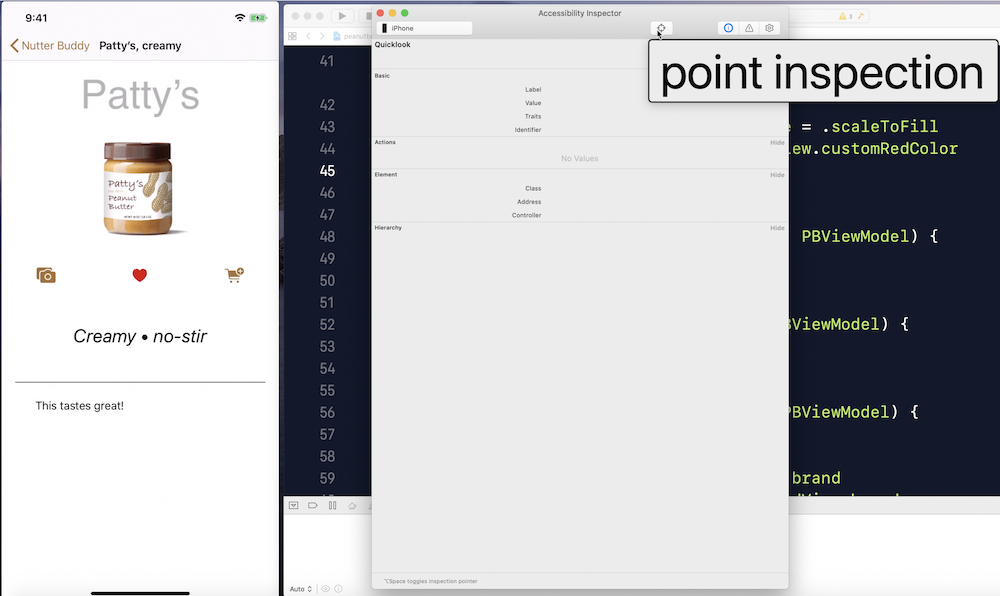
Point inspection:

Potential inaccessible text
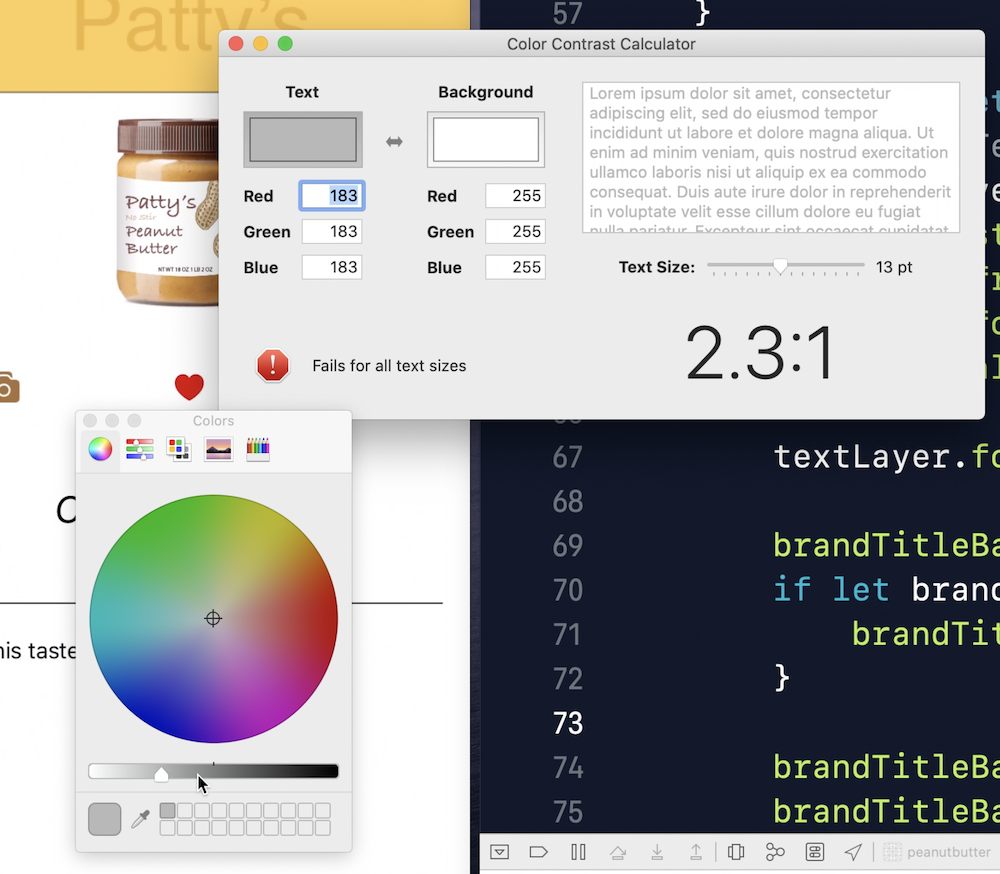
Contrast failed
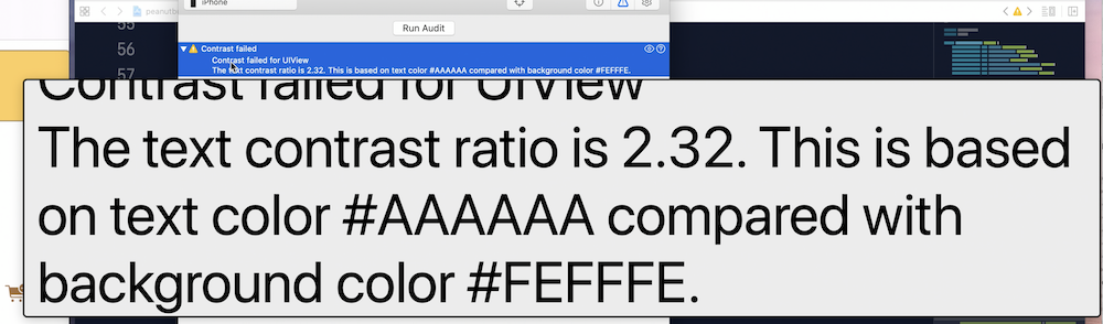
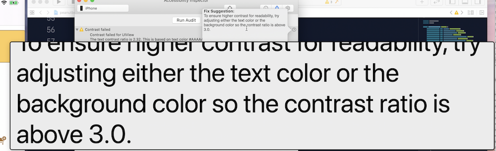
Open color contrast

Make your app visually accessible (2020)
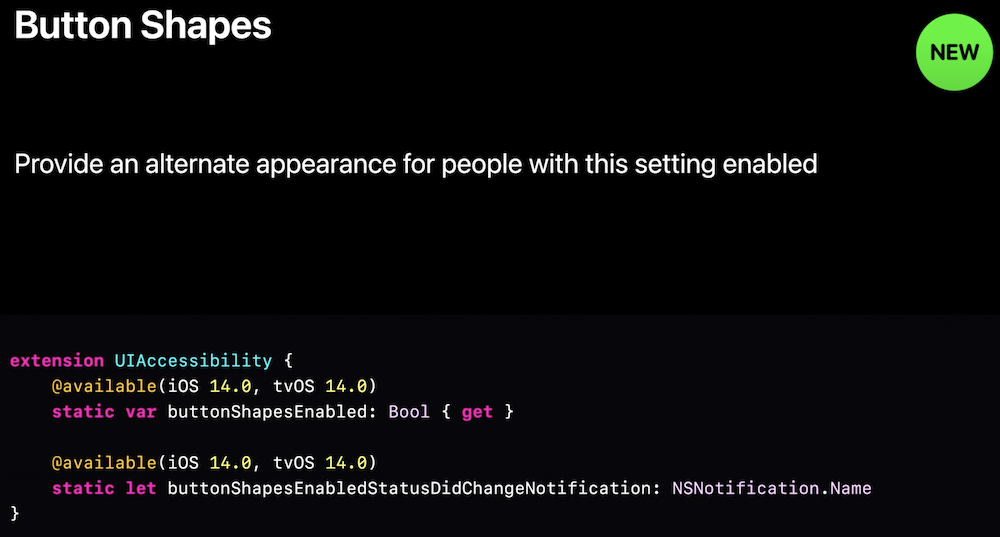
Button Shapes
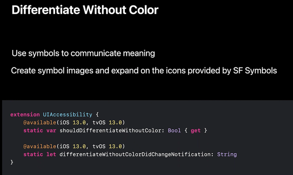
Differentiate without colour
High contrast

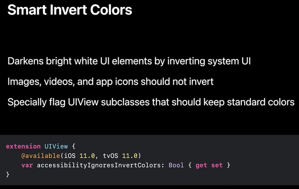
Smart inver Colors
Clarity and readability
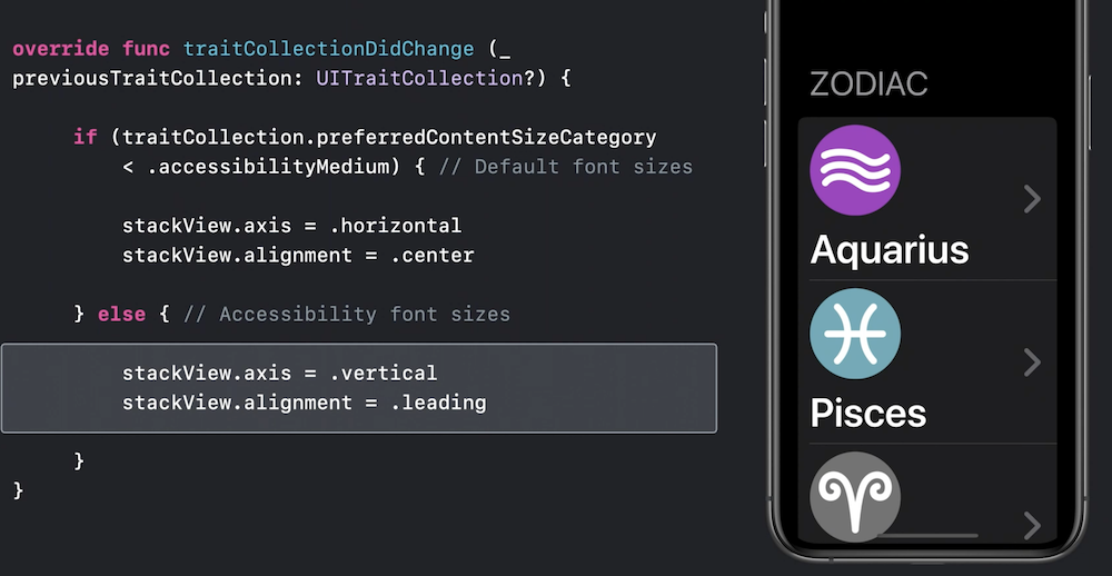
Large text

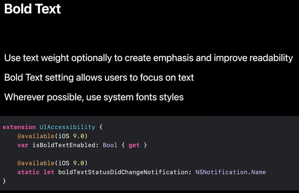
Bold text
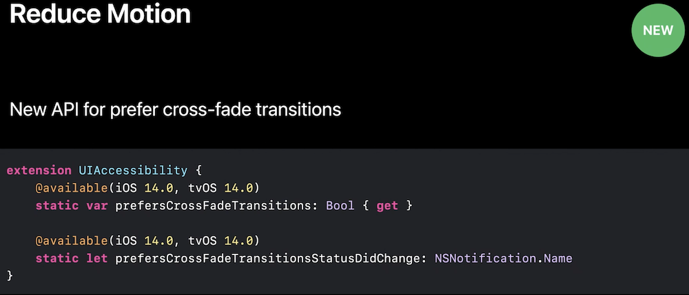
Reduce Motion


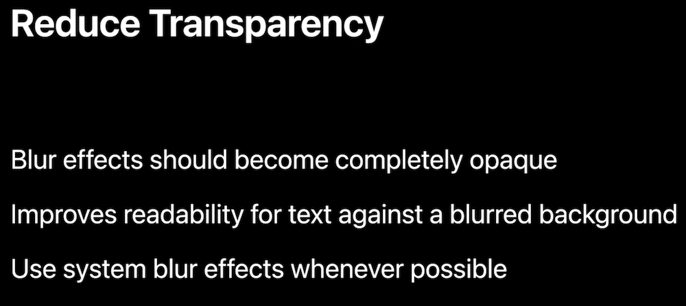
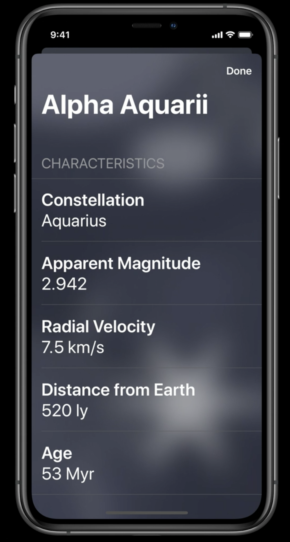
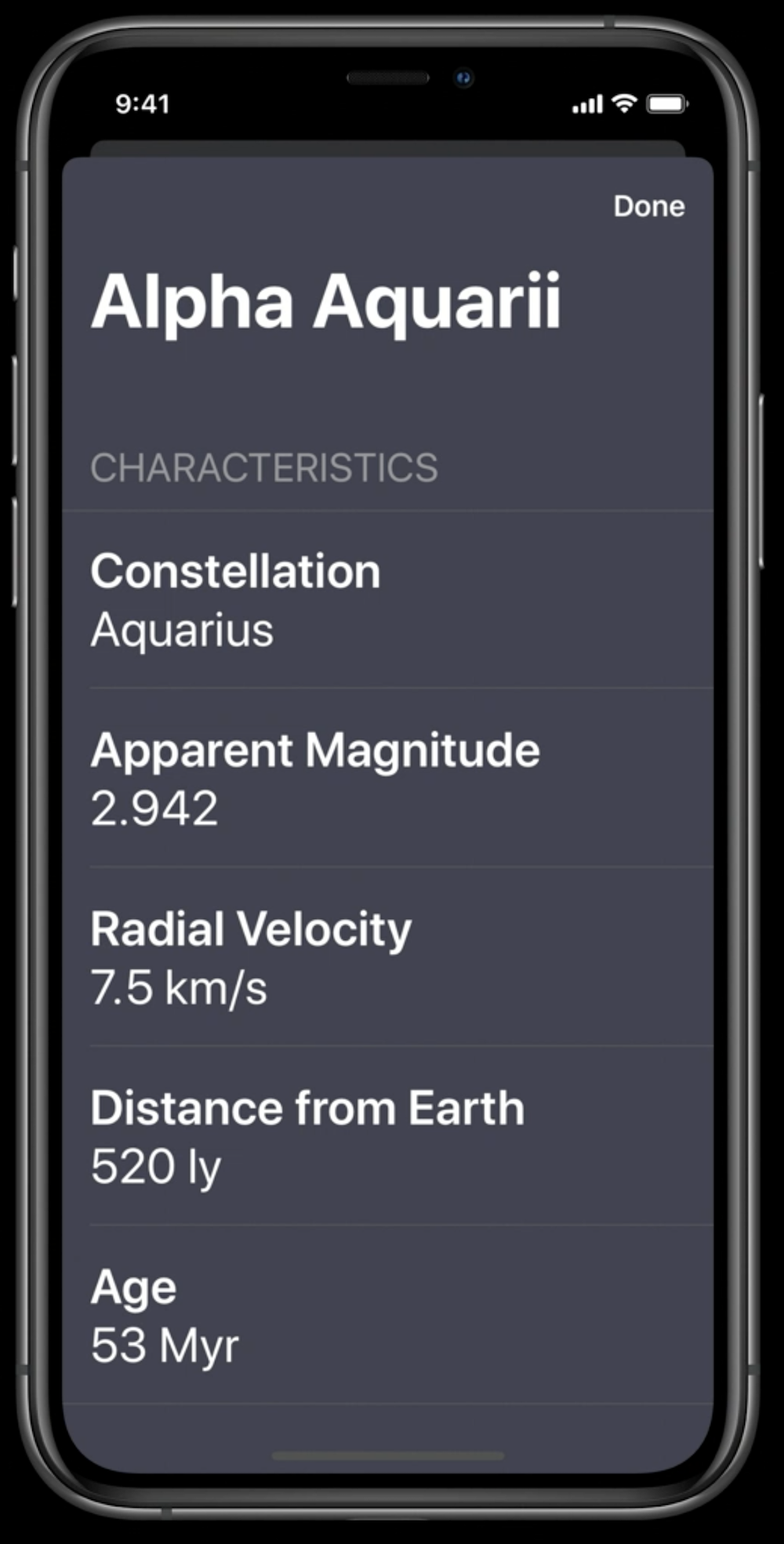
Reduce Transparency
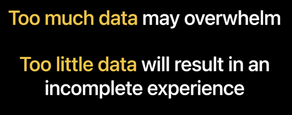
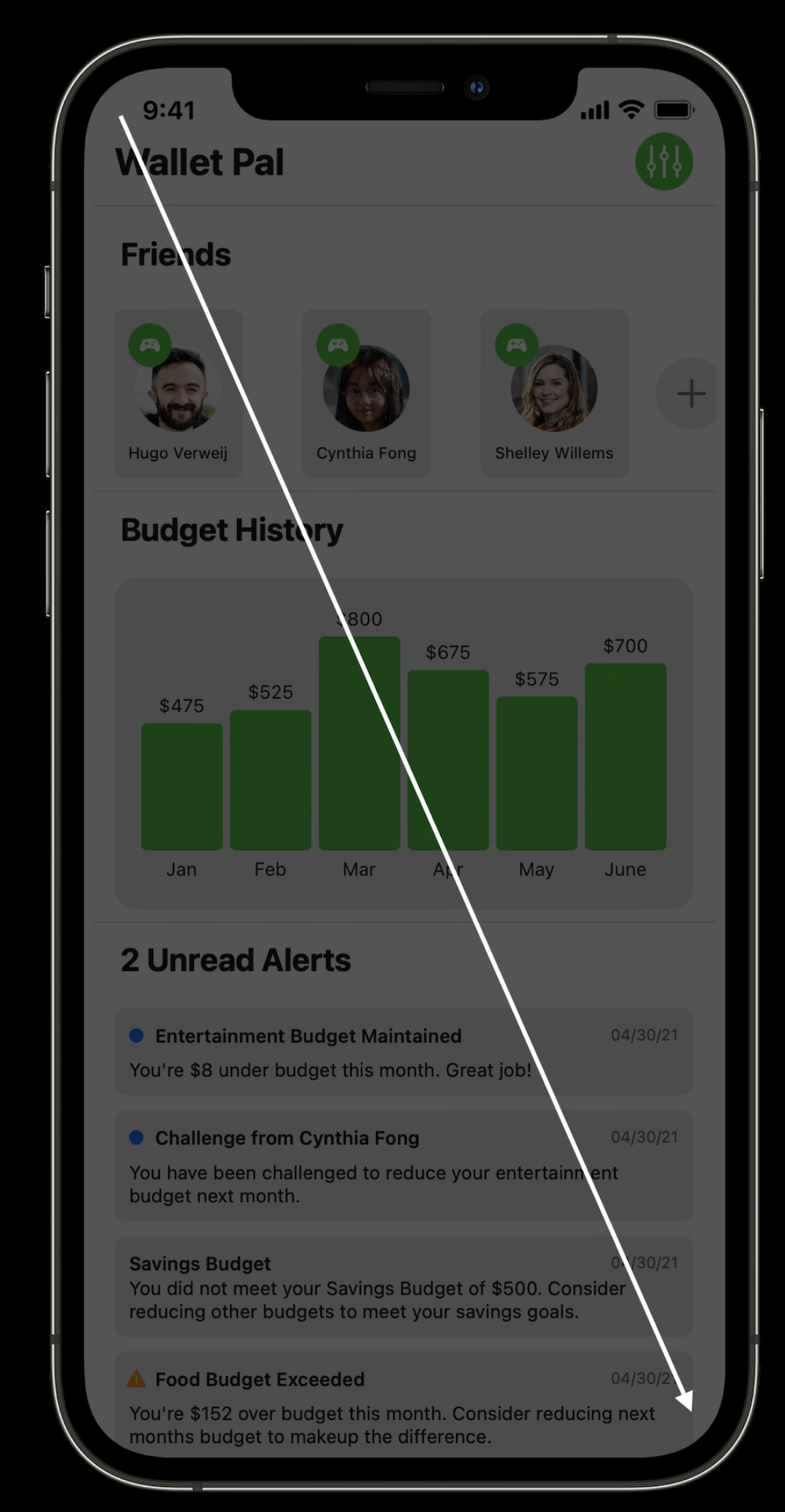
Tailor your voice over experience in your data rich apps (2021)
Choose text carefully
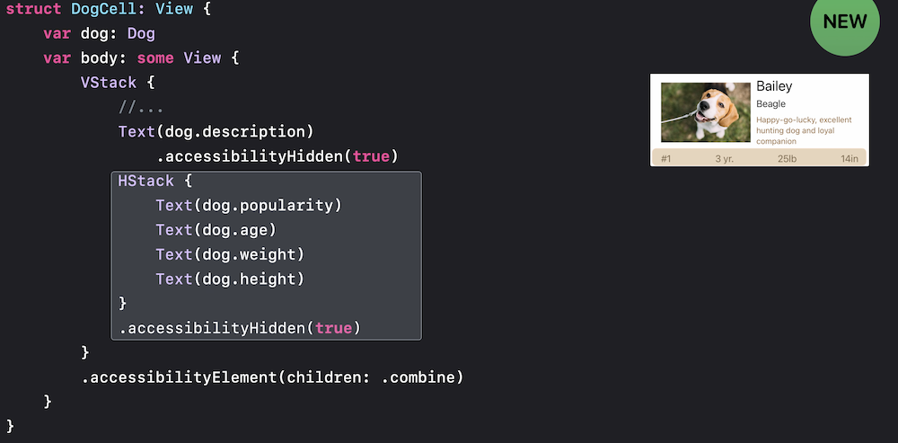
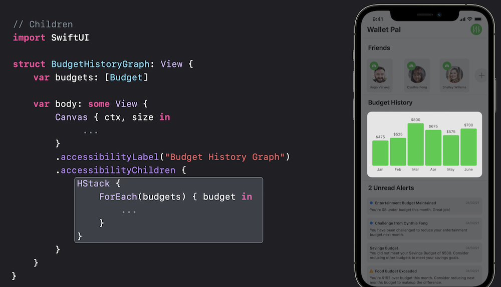
Group views:
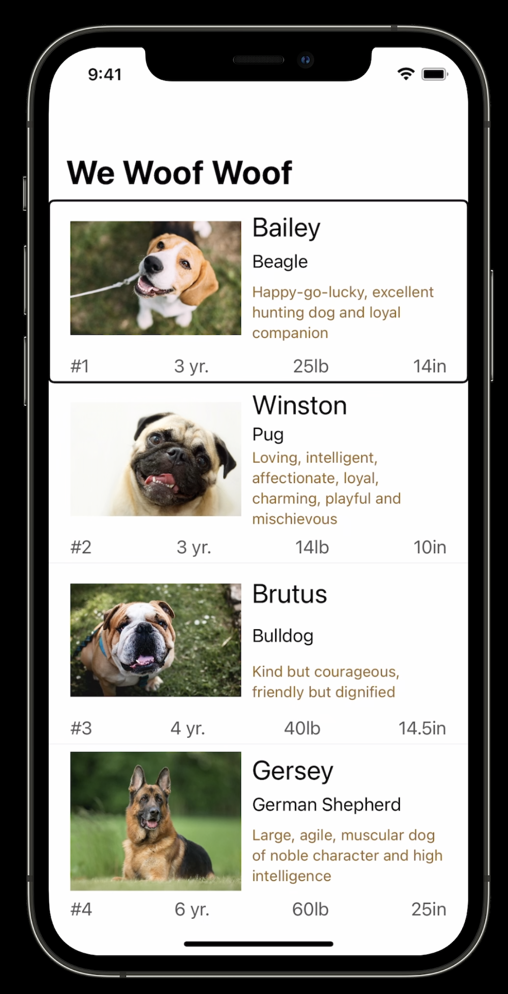
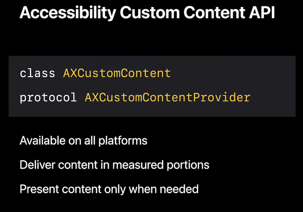
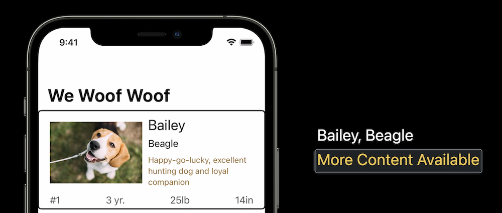
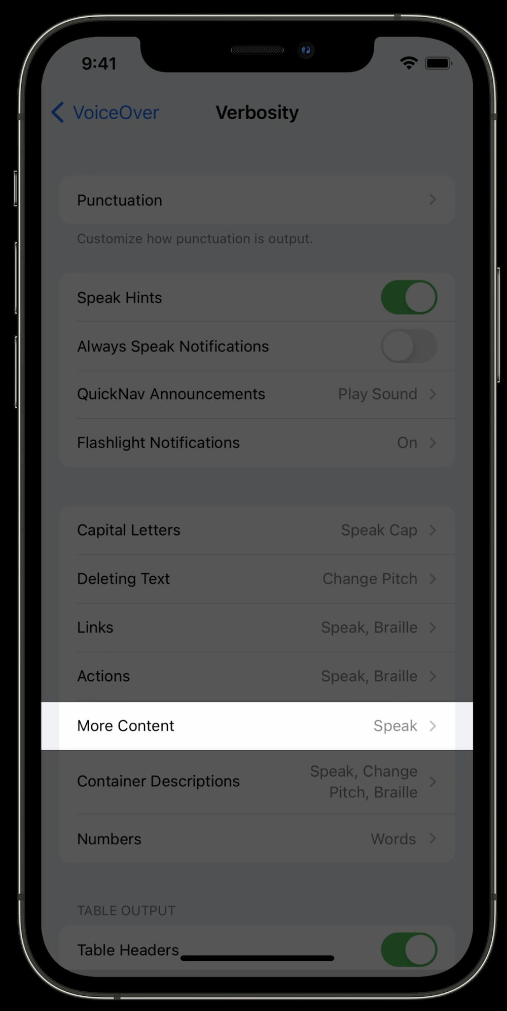
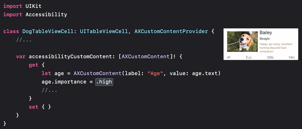
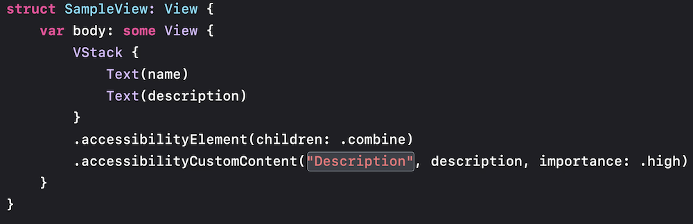
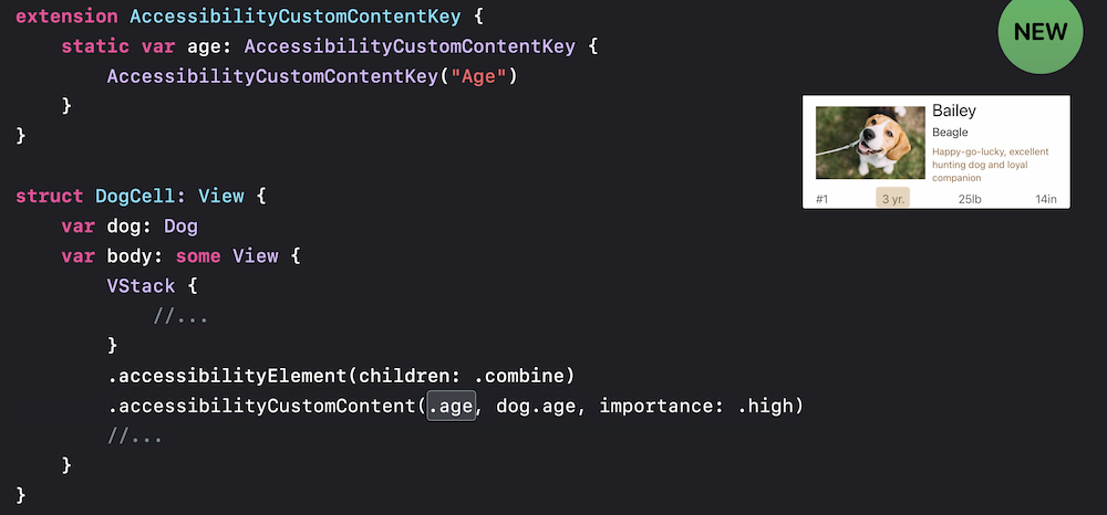
Use custom content
Is as a rotor also


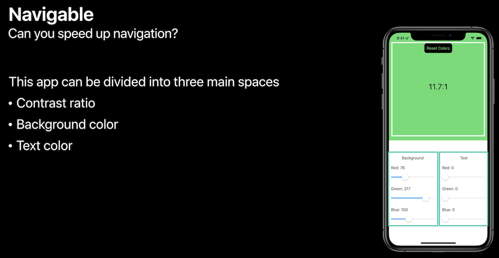
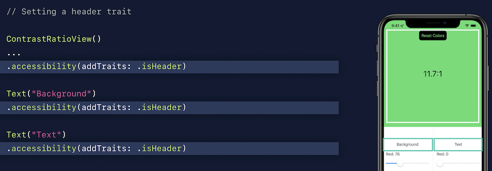
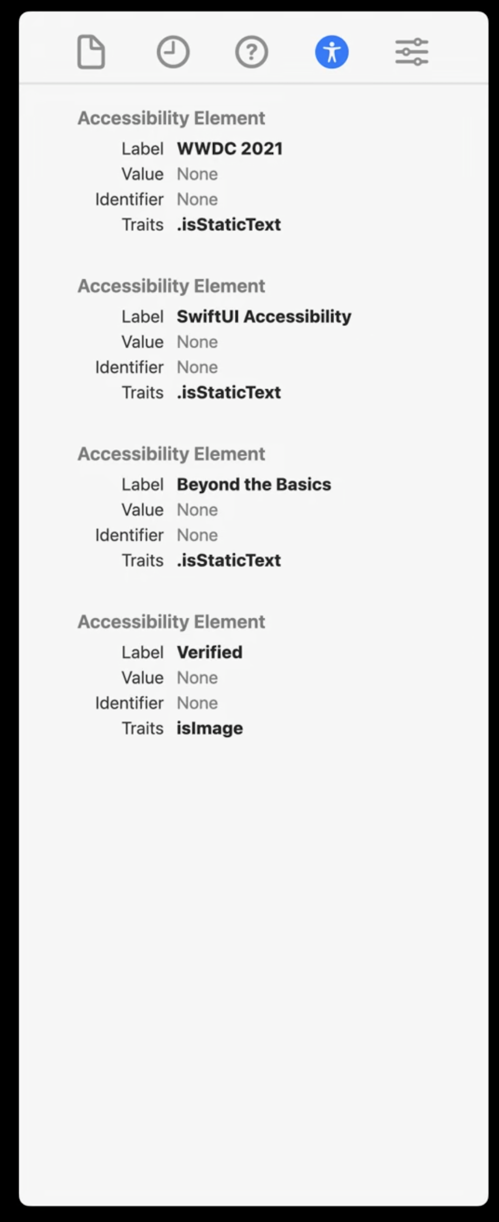
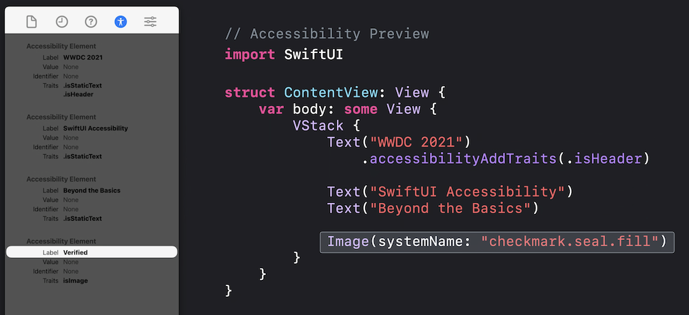
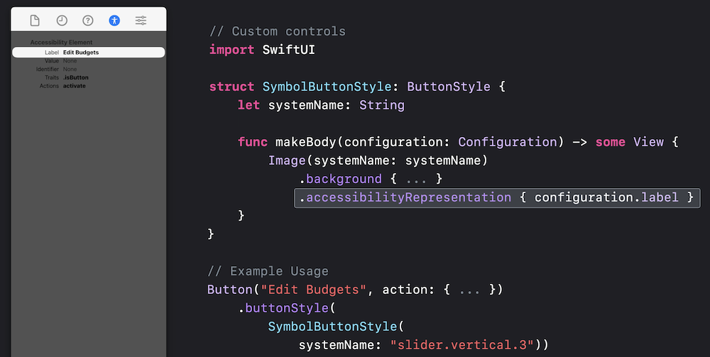
SwiftUI accessibility beyond the basics (2021)
New tab
Use system image but check accessibility

Use system representation for a11y text:
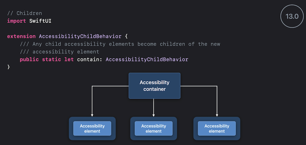
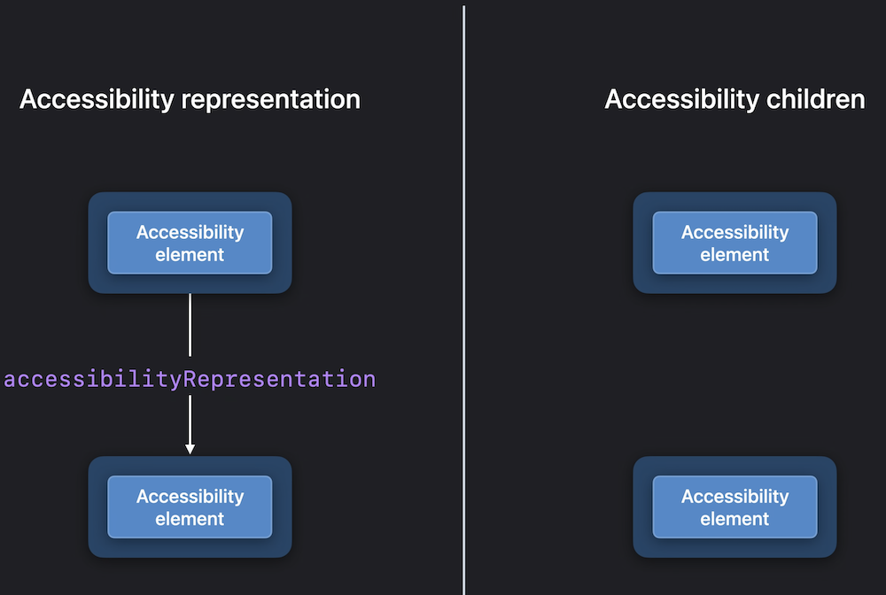
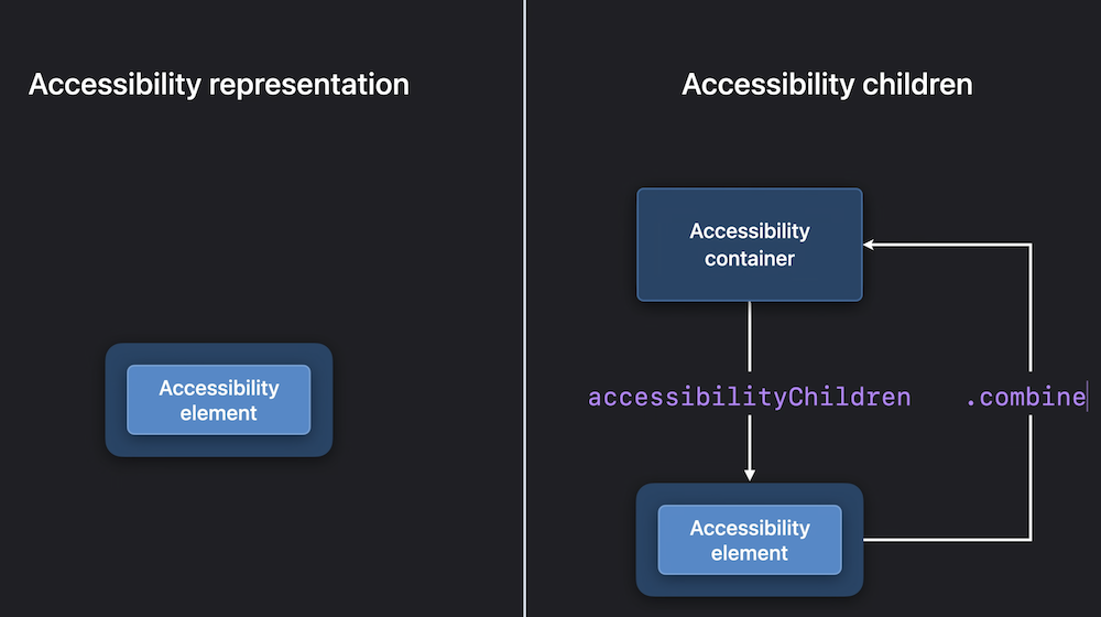
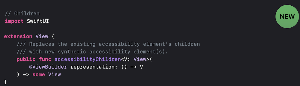
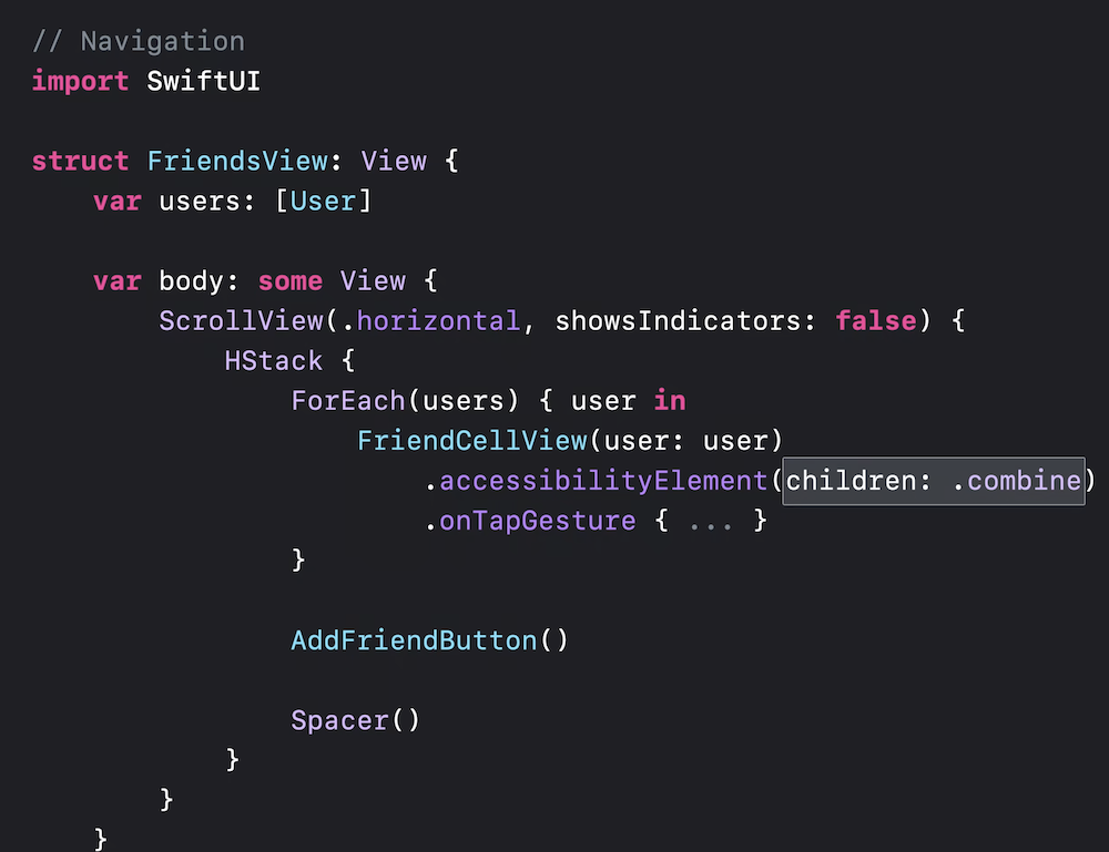
Accessibility Container
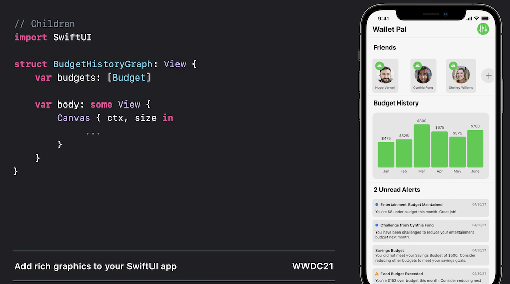
Graphs:

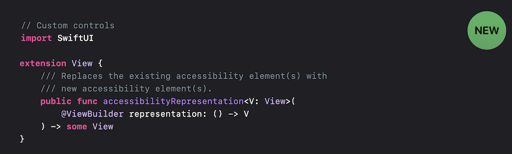
A11y representation vs a11y children

Screen reader
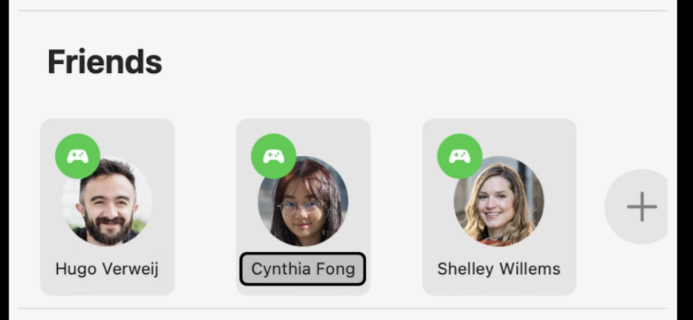
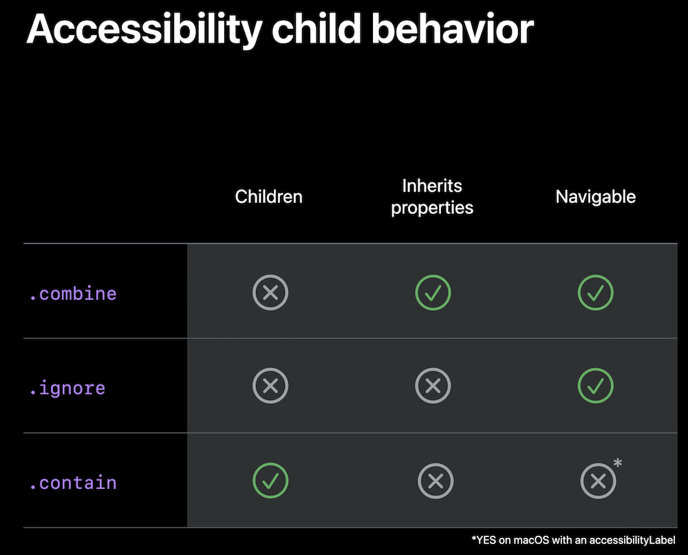
.contain
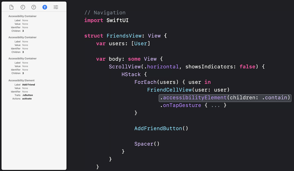
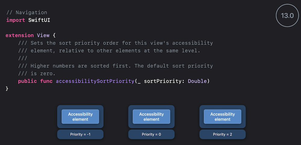
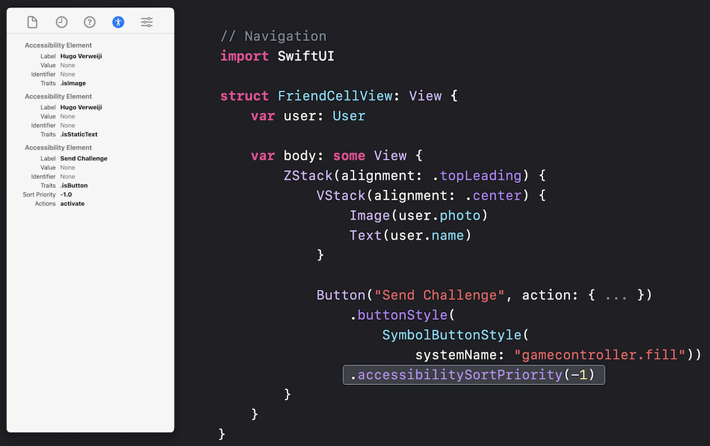
sort priority
.combine
Child behavior table:
Rotor entry
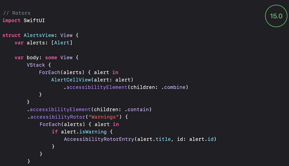

Accessibility custom rotors

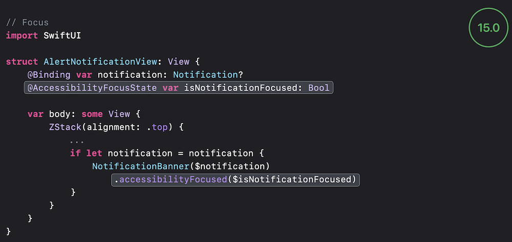
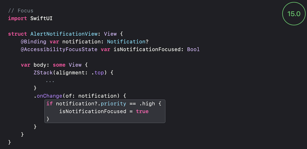
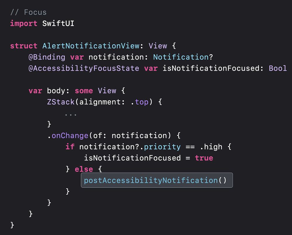
Focus updates:
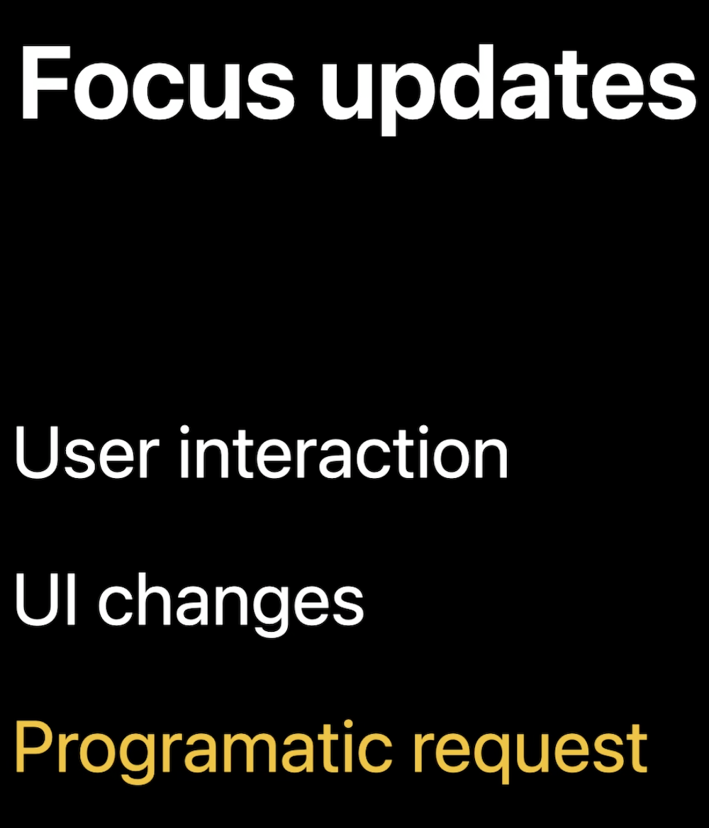
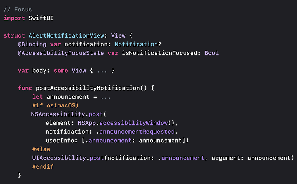
Notifications


